27/09/2024
10 car logo meaning that you may not know the truth behind
Car logos are the identity of the car which represent the brand and nowadays people know the cars by its logo, and logo is important because it carries deep meaning that connects with history, philosophy and aspirations of the company.
Many car logos have fascinating stories behind them, which reveals about the journey of the brand or its mission statement.logo depicts the legacy of the car which attracts the public.So let’s seek into the hidden truth behind the logos of ten cars and reveal the truth behind their designs and what they truly symbolize.
1.Mercedes-Benz:The Tri-Star Symbol

The Mercedes Benz is a luxurious German brand,which is leading the world today. Its iconic three-pointed star logo was created to represent land, sea and air, the three areas Gottlieb envisioned his engines dominating.
The final piece of the modern badge came into existence 1926, when Daimler merged with Benz, and formed Mercedes-Benz encompassing the three-pointed star in a ring to signify the unification between the two companies.
The company Daimler-Benz, created a car named Mercedes in 1900.Eventually,Maybach and Emil Jellinek would take over the company, but Daimler’s sons remained involved in the company for several years.
One day in 1909, the two Daimler brothers remembered a postcard that had been sent to them by their father in 1872. On the postcard, he had marked the location of their family home with a distinctive three-pointed star in honor of their father, the brothers acquired the logo and started embellish it on all of their vehicles.
Mercedes-Benz may not be able to rule on the sea and air, but it has ruled the land.
2.BMW: The Blue and White Roundel
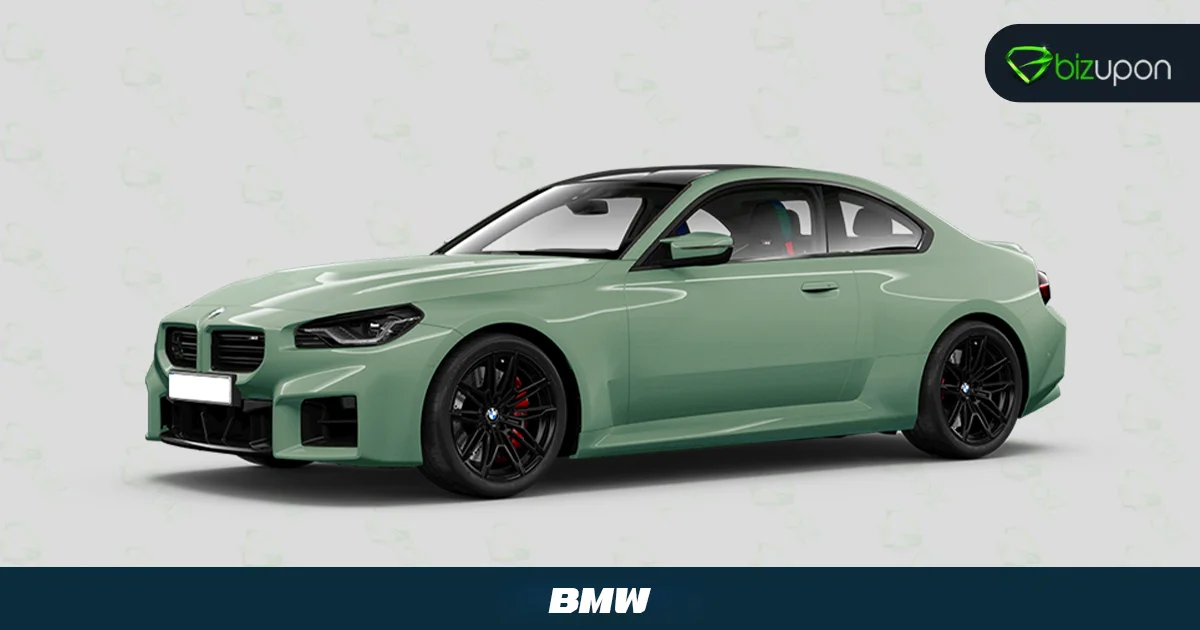
BMW(Bavarian motor work) its iconic blue and white roundel represents an airplane propeller, which directly links it to the company’s origins in flight during world war I.However, this information is partially accurate. As BMW historians made it clear that the propeller symbol is wrong.
The truth is that the blue and white color in the logo represents the flag of Bavaria,the region in Germany where BMW originated and came into existence.
3.Ferrari: Prancing Horse
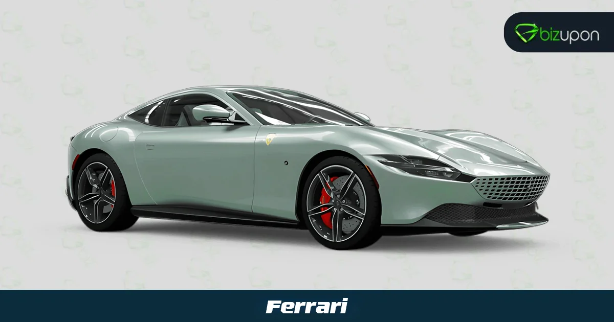
Ferrari’s prancing horse logo symbolizes speed, power, and luxury.The story behind this iconic badge is the prancing horse was originally the symbol of Francesco Baracca,a renowned and celebrated Italian world war I fighter pilot.
After Baracca’s death, his mother suggested that Enzo Ferrari use the symbol for good luck on his race cars. Then Ferrari adopted the logo with a yellow background, which represents his hometown of Modena.
The prancing horse has since become one of the most adorable symbols in automotive history.
4. Audi: Four Rings
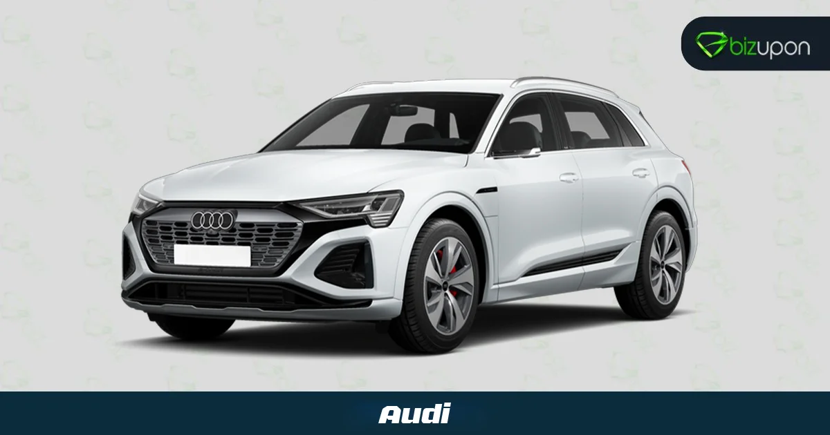
It's the most famous luxury car symbol in the world but do you know why Audi has four rings? People think that it is something to do with the Olympics but they're wrong.
In 1899, when German Industrialist August Horch started his first car company naming it after himself. But when he left that company and started a second car maker in 1910 he couldn’t use his surname then he translated his surname Horch into latin, which is Audi.
After Few Decades, the brand’s fortunes was not been stable which hits the loss to the company and in 1932 Horch and Audi merged with two other german car and bike maker DKW and wanderer to form auto union. The Four rings symbolizes the four separate brands that came together, interlinked to show the connection between each of them.
5. Porsche: Prancing Horse

Porsche is a German automobile manufacturer specializing in luxurious high performance Sports Car, SUV and Sedan. Its logo is similar to the Ferrari, a prancing horse at the center of the porsche’s crest.this reflects the rivalry between two luxurious cars. The story goes that baracca originally took his icon from the stuttgart coat of arms (reportedly from the german pilot he shot down) and porsche also drew inspiration for its badge.
The Porsche symbol pays tribute to Stuttgart and also the Wurttemberg’s old coat of arms is a Porsche’s logo origin.
Some rumors also claim that Francesco Baracca used the logo on his plane to honor the conquered German foes, who had used the symbol of the prancing pony on his own plane because he was from stuttgart.
6. Rolls Royce: The Spirit Of Ecstasy
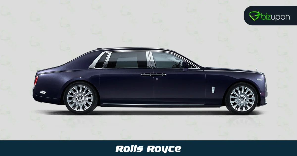
‘Rolls Royce’ the car, which is the perfect example of beauty, elegance and Class and the small sculpture sitting on the front of the Rolls Royce ‘The Spirit of Ecstasy’ enhances the beauty of the car. But did you know the story of this adorable beauty?
The legend goes that when John Walter the 2nd Montagu Baron wanted a personal logo for his 1909 Rolls Royce silver ghost.so he ordered a sculpture of his secretary, Eleanor Velasco Thornton as he has a long-term with her which he kept a secret from everyone.
The original sculpture of Ms Thoronton was known as ‘The Whisper’ as it featured her with a finger to her lips,as a sign of their secret affair.
In 1911 rolls royce wanted a permanent badge for its model and asked walter if it could use a modified version of ‘The Whisper’, which now featured the female figure with both arms back with flowing gown behind her, it was known as The Spirit of Ecstasy and has been the part of brand ever since.
7. Lamborghini: Rampaging Bull
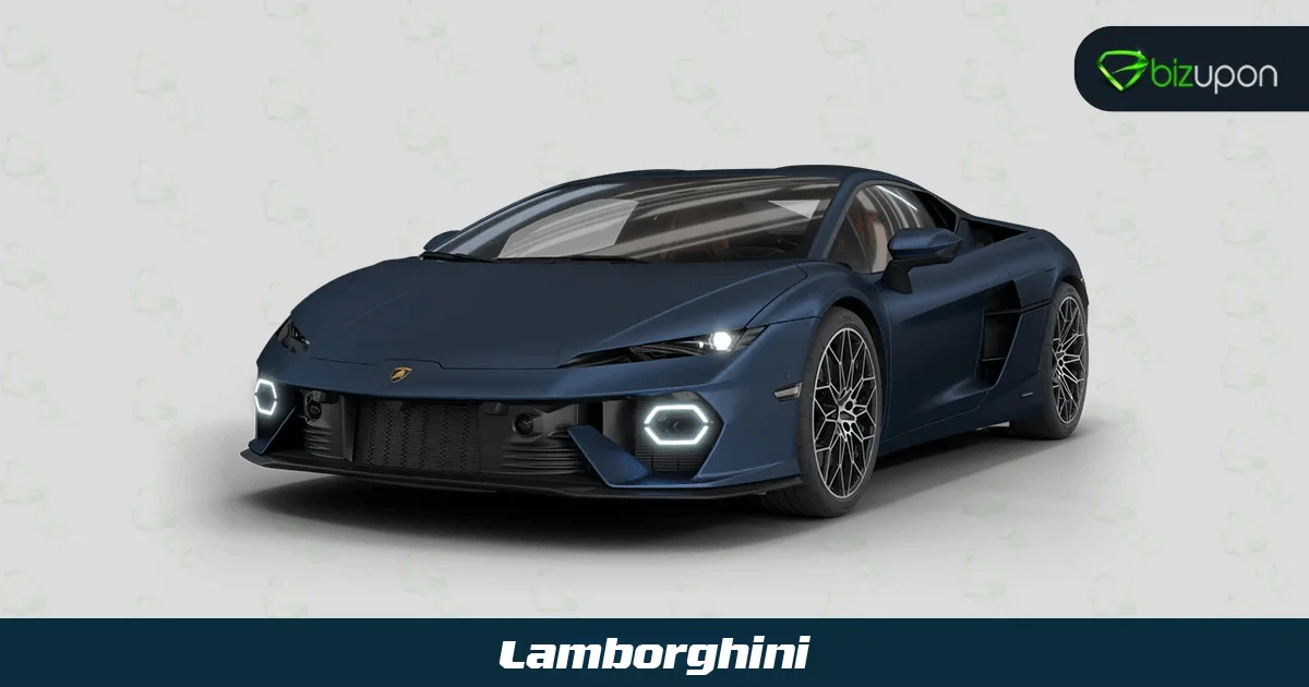
Lamborghini may not have a deep controversial story but a little story of fortune. It has been embellished with a rampaging bull.
Company’s founder was Ferruccio Lamborghini and his zodiac was Taurus, so he had an interest in bulls he thought that bulls were lucky to him so not only did he use a bull as his badge, he reportedly enjoyed watching bull fights and decided to name his cars after bullfighting connections, including Miura Murcielago gallardo Aventador and more.
8. Jaguar: Leaper A Jumping Jaguar
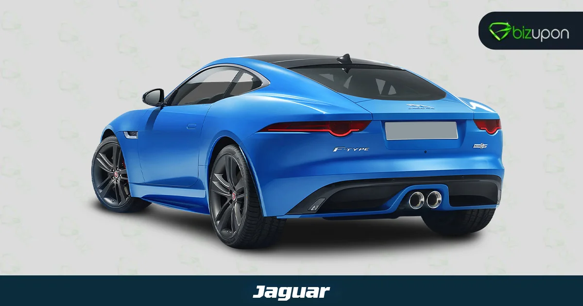
Jaguar is a luxury brand, created in 1922 in the U.K., is famous for designing and manufacturing high-end cars. Previously, it has been a part of BMC and Ford, and finally was bought by Land Rover in 2013. It grew into Jaguar Land Rover Group, owned by Tata Motors.
The Jaguar logo is known as Leaper and is an image of a jumping jaguar.
Its logo has been changed five times since now
1922-1935
The Swallow Sidecar Company logo was composed of a bright-blue circle in a red frame, with two gold wings. The handwritten-styled wordmark was placed inside the circle and executed in yellow-gold.
1935-1945
In 1935 the Jaguar logo looked pretty much as it had a monogram with the SS German symbol, standing for Swallow Sidecar, carved with a sharp geometric font on a hexagon, encircled between two stylized wings. The color was brown with black accents and straight lines. Jaguar has been written in the hexagon with the uppercase. This badge was suspended after World War II finished.
1945-1951
The most controversial period for the company. The 1930s logo was a hexagon with eagles wings and tail and an “SS” wordmark in the middle of the geometric figure. The bold lines had a strong impact and the logo looked powerful and decent in a monochrome palette.
1957-1982
In 1957 the new concept for the Jaguar badge was created by the designers. It was circular in shape with an orange-red background. It is like a medal. The central part of the medallion was decorated by a stylized golden head of the wild cat, and the name of the company was written in gold uppercase with stylish fonts
2012-2021
In 2021 the redesigned logo brought back the strong and impactful jaguar badge with the lines of the leaping cat emboldened and a bit modified. Jaguar was rewritten in new extended and bold letters. This new logo became the voice of the brand.
9.Toyota: Three Oval logos
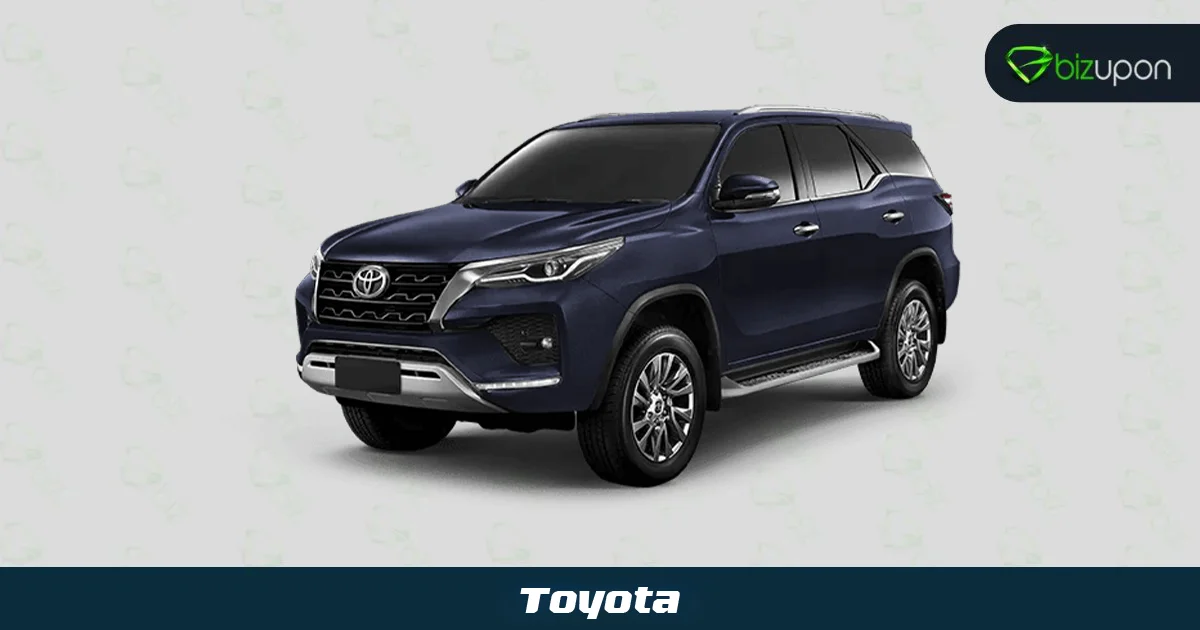
Toyota’s three oval logos are from early 90s.large oval on behalf of the Earth, in the middle by a vertical combination of two ellipses into a T-word, on behalf of Toyota.
The symbol of the toyota is based on future success, confidence and ambition. Symbol also gives the message that the bond between the customer and automotive manufacturers is connected by heart which helps in building a mutual trust between them.
10. Skoda: A Huge Ring with Bird Wings
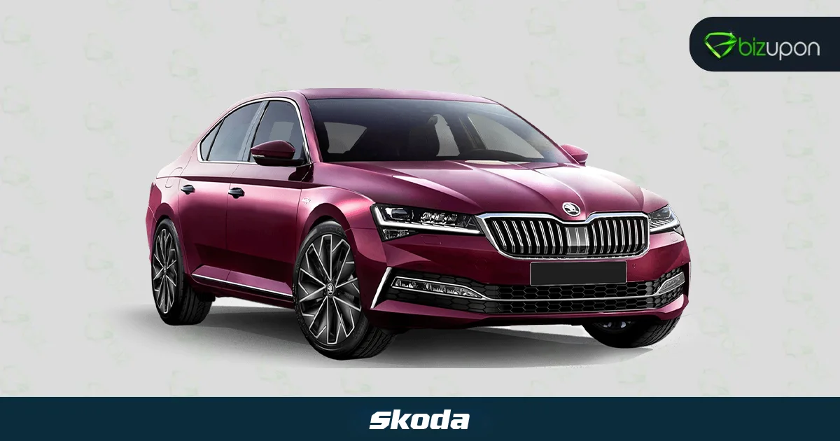
A huge ring in Skoda’s symbol symbolizes that it is an impeccable product for the world and the bird wings symbolizes the product is progressing technologically worldwide a right flight of the arrow, the symbol of advanced process; the outer ring in the black color symbolizes the more than 100 years of Skoda; center covered with green, which expresses that Skoda people are also concerned about environment and focus on renewable resources.